Click here to view my CCR!
Until next time, Lysh :)
Monday, April 10, 2017
Sunday, April 9, 2017


The Grand Finale
This past week has been amazing and I am very proud of my final product. Although I will still add few changes before I turn my project, it is still beautiful! I finished my two page spread the other day and have put some final touches on each page. This process has been so wonderful and I have never thought the day would come where I got the opportunity to create my very own magazine. I truly am so proud of my work. I began this project with very little prior knowledge. I had't known how to layout a page, how to take an epic photo of food, or even known what a "masthead" was! This process has taught me how to use hardware and software for various usages, how to work with one another, how to blog, and how to make an idea into reality. Another thing I has learned is the power of the IPhone. By just using the IPhone 7 and a white sheet, my photos came out almost professional! I also got a taste of how tough it really is to get that perfect picture.
And not to mention, research has played a very large role in the making of this project as well. Researching multiple magazines, photos, layouts, genres, conventions, how to make my own photography studio, and more has been the sole purpose of how I really created this masterpiece.
...and a big shoutout to my partner Paige Lewis for being there every step of the way. Although we didn't always agree on everything, we created something amazing! Anyways, I can't wait to upload my CCR and final magazine! :)
Until next time, Lysh
Thursday, April 6, 2017
Helping Hand
Today I met with my partner again after school, but this time it was to help her!
She needed to take pictures for her own two page spread for her July edition of "Bitez". Her two page spread consists of a summer do it yourself popsicle, but with a twist. There is actually two twists, the first is that there is cool candy involved such as sour patch and airheads but the second is an optional add in for adults of drinking age. We researched for a while to actually find a good recipe and Tasty, a popular recipe company, had this amazing idea! We changed it up a little by having optional alcohol although.
Today we went to the grocery store and purchased popsicle molds, sour candy, air heads, jolly ranchers, and sprite. We also set up another photography homemade studio by taping a white sheet to her wall and beneath it. The set up looked like this:

As we did with my photos, we took about an hour to get the perfect shots. She took photos with her iPhone 7 and did pictures of the process of actually making the popsicles with each step of the way. After they were done freezing, we needed to get the perfect shot for her two page spread!
On the other hand, my magazine is coming together very nicely. We have decided that we will not be using a bite mark in the right hand corner because it doesn't look nice on the cover and takes up some room, we think the bite on the 'B' will indicate that our magazine is pronounced "Bites". My cover is finished as my table of contents is as well! Tomorrow my two page spread will be finalized and we will start our commentary this coming Saturday! I can't wait for the final product :)
Until next time, Lysh
Tuesday, April 4, 2017
Laying out... but not by the sun
I have almost completed my cover page, it needs just a few finishing touches. I added all my content on to the cover page, my photo, and finalized font and colors.
Today and yesterday I have been working with my table of contents and two page spread. My table of contents has a layout, title, and photo but I still need to add actual content onto the page. The page will include my two page spread which is the "always included". My table of contents will also include "latest trends", and "bakin' it" section. Latest trends are baking and food trends that are popular, fun, and easy to do! The bakin' it section will be articles and interviews of bakers in different parts of the country or will feature a certain pastry or baked item that is interesting and has background to it. My table of contents layout can be seen in my previous blogs to refer back to it.
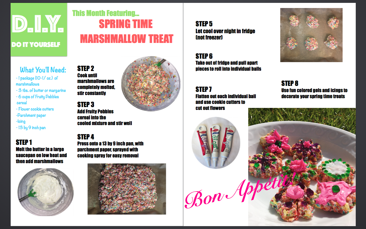
My two page spread has begun it's layout process, but it has been quite challenging. The two page spread is going to be the "always included" D.I.Y. snack of the month. As I began to design it without any example to refer to, I came up with a pretty cool design. Here it is below:


Today and yesterday I have been working with my table of contents and two page spread. My table of contents has a layout, title, and photo but I still need to add actual content onto the page. The page will include my two page spread which is the "always included". My table of contents will also include "latest trends", and "bakin' it" section. Latest trends are baking and food trends that are popular, fun, and easy to do! The bakin' it section will be articles and interviews of bakers in different parts of the country or will feature a certain pastry or baked item that is interesting and has background to it. My table of contents layout can be seen in my previous blogs to refer back to it.
My two page spread has begun it's layout process, but it has been quite challenging. The two page spread is going to be the "always included" D.I.Y. snack of the month. As I began to design it without any example to refer to, I came up with a pretty cool design. Here it is below:

Colors are not final and will change according to season/month of the issue. For instance, my partner who will be completing a July/summer edition may use blues and yellows to represent summer or red, white, and blue to represent the Fourth of July. Because my edition is April/Spring, I will be using pastel colors, such as the ones in the photo above. The other page of my two page spread will be an entire photo of the final product. One side of the two page spread are directions and materials and the other side is the final product/what it should look like. I've seen this in this specific baking magazine below and I find it appealing to the eye.
This is not exactly how I would like my two page spread layout to look like, I would like a full picture on the right page and the instructions on the left with a white background. I like the idea of having one whole page to show the final result because it catches the consumers eye, shows an example of how it should come out, and is very aesthetically beautiful. By tomorrow, the two page spread will be done as will the table of contents. After that, the advertisement will be out into motion!
Until next time, Lysh
Sunday, April 2, 2017
Things Are Starting To Really Come Together
As days pass by, the dead line is coming closer and closer! This week I stepped up my game and got a lot of important things done. My partner and I have taken our photos, agreed on colors, font, layout, and have started putting our imagination to the test. After meeting up 5 times over the course of this past week, we have taken over 1,000 photos, created multiple dishes, and really made some final decisions.
Photography
My partner and I went to Public and purchased multiple necessities for our photoshoot. We purchased items such as sprinkles, icing, floral decoration, easter confetti, and the ingredients for our two page spread always included "D.I.Y. snack of the month".
To take photos, We used natural light, a bright lamp,, and a white sheet. Some photos were also taken outside. Here is what our set up looked like:

My partner and I decided to use just our iPhones to take photos because we did not have access to a professional camera, although, iPhones had very nice quality.
The first photoshoot consisted of my cover page. My cover page was for an April edition, so I incorporated spring and easter into the cover! I have yellow confetti as my background and homemade cupcakes placed in a triangle shape surrounded by marshmallow chicks and decorative flowers. Here's what the photo looks like

The second series of photos was the process of my D.I.Y treat, which was fruity pebble marshmallow treat in the shape of flowers, decorated with icing in spirit of spring! I took photos of each instruction and step of the way so I can incorporate into my "how to make it" two page spread.
The third photo shoot was for my table of contents. Originally, my photos where quite sloppy so I had to take them over the course of two days. Here is the before and after photos to show my improvement:


As you can clearly see, the second photo is much cleaner, a nicer image, and has better lighting. I also decided to include flowers in my table on contents because it will be a spring edition. I imagine "Table Of Contents" written on the rolling pin and then the actual magazine content written on the right bottom corner.
Some other final decisions my partner and I decided to make was to get rid of the border. Although my original idea was to have the cover be very shape-ish, clean, and with a border, we have decided it looks much better and more professional without it. Our coverage will still be aesthetically pleasing and will involve some pink lettering because we have found that many baking magazines incorporate pink into their magazines.
Over the course of this week, I'm hoping to design my two page spread layout, add graphics, complete my table of contents, and create an advertisement to place next to my table of contents.
Until next time, Lysh
Wednesday, March 29, 2017
Back On Track
Finally, I am back on track! After looking over some major issues, my partner and I sat down and discussed. We agreed on a final layout for our table of contents, a final font, and took some awesome pictures. We will be mimicking this style of layout below for our table of contents:


Our table of contents background photo will be an image pertaining to food/baking, the words "Table of Contents" will always be placed creatively, and we will have our content information on the right side as well. Heres a draft of what I would like mine to look like:

There will be information on the right bottom under the rolling pin, which will be done by Tuesday the 4th.
As for my cover page, I took over 200 photos today to get a perfect shot and I ended up with a very nice cover image!

Since I am doing an April edition, I wanted my cover image to be very spring! By spring I mean refer to flowers, easter, and pastel colors. Here is what this image would look like as my cover image:
(not a finalized product, just the idea)

Looking at it now, I'm not sure if I still like the boarder on my magazine.
There is still much work to be done but I am extremely proud of the progress I have made and cannot wait for the final result! Tomorrow My partner and I will be finalizing our advertisement, two page spread layout, main color, and magazine content in general. I will also be researching how to "take a bite" out of the "B" and the bottom right corner and how to utilize graphics in my magazine!
Until next time, Lysh
Tuesday, March 28, 2017
....And Some More Issues
After meeting with my peers again today, I received even more feedback. I presented an outline I've created online and my peers agreed that my outline looks as if my partner and I are unaware of what a proper magazine looks like. I would still like to keep my border, but there are going to need to be some minor changes on our cover page layout. Besides that, I have come up with a solution for our Title and color! Our main colors will be orange, black, and white. The border will be orange, the font will be black, and the "Z" on "Bitez" will be orange (the same shade as the border). To make sure consumers view our title as "Bitez", the z will stand out and there will be a bite mark on the B. We have also decided that instead of making our cover page "blockish", we are going to have our cover image fill the entire page but still inside the border and there will be more cover lines than we have originally planned. Although I was very excited to challenge the typical food/baking magazine characteristics, I will still be able to make my magazine unique and artistic.
Today after school I met with my partner to start re-modeling our cover page.
Here is our VERY rough draft without any photos yet and below is just a general layout. *pictures will be done on Thursday*


Today after school I met with my partner to start re-modeling our cover page.
Here is our VERY rough draft without any photos yet and below is just a general layout. *pictures will be done on Thursday*

We agreed to use the font "impact" and bold it and we have clearly chosen orange as our main magazine color.
Today we also took some pictures to practice:
And below is me actually creating this Photo opportunity
After practicing and challenging our creativity, we will get prepared to take our final photos on Thursday.
Until next time, Lysh
Friday, March 24, 2017
Bad News
My partner and I began to layout out magazine today in Pages and played around with colors, fonts and shapes. We had realized that "BITEZ", our title, looks as if it pronounces "bite-ez". Also, our pastel pink doesn't quite fit the genre of food, pink is more of a beauty or fashion genre magazine. So basically, there is going to need to be some changes.
Word play
For our title to make sense, my partner and I either need to change the title or play around with the word "Bitez". We tried making the 'z' lowercase, and it not a horrible option but we are still working on it. Another option could be changing the title to "Chomp" or "Munch", which is similar to "bite".
Wordplay is pertaining to a word that tends to be the main subject and is a literary term that uses wit to pull attention to the main subject.
Colors
Pastel pink will sadly not be able to be used in our magazine. After reviewing, my partner and I realized that pink appeals more to the target audience rather than our magazine content, which is food. I did some research that explained colors, their meaning, and how to use them. Yellow is exciting and cheerful. Yellow also be sued in designs concerning children and although children can pertain to women, there is a possibility that yellow could be a good color. Green is calming, balancing, and rejuvenating. Green can be used to represent stability and affluence. Green may be a possibility, but I still think yellow is the best bet. Orange is vibrant and inviting. It is usually used to depict movement and energy but subtly, although, our magazine isn't quite trying to give that impression. I think a pastel bright yellow would be a great color to use, and many other food magazines use yellow as well. However, red expresses passion and power. I think using red or pink slightly can be put to good use as well.


Until next time, Lysh
Wednesday, March 22, 2017
Decisions, decisions...
Hello and welcome back!
Yesterday I had the opportunity to meet in groups of other students also working on their portfolio project, so I got some great feedback. In overview, I was put in a group mixed with students who were creating a magazine (like me) and those creating a film opening, so I got multiple perspectives! After presenting to my group, they agreed that they like pastel pink as my border and title name, they like my "aesthetically pleasing" theme, and they also like my "bite" trademark. Most of them really liked the idea of challenging the genre by using an unordinary style because food magazines are usually cluttered and have many bright, neon colors and I am choosing to go another route by using bold fonts, shapes, graphics, and limited words on the cover. Although, one student mentioned that my magazine is focused more towards small snacks and baking and that "Bitez", my title, also moved him to think that way. I'm not very sure if I should still refer to my magazine as a food magazine or a baking magazine, or if there is even a difference! So I did some research to find out.
This website helped me understand that food magazines and baking/cooking magazines are, in fact, different. Cooking/baking magazines lean towards actually creating dishes and preparing food whereas for magazines are just about food in general, such as restaurants with good food or a food of the month. While my magazine can still fit under the "food" category, it will be more of a baking magazine.
Thus being that my magazine will promote baking, I think the table of contents (referenced in my previous posts) I would like to imitate would be the letters cut out of dough spelling "table of contents". I think it is very artistic and clearly exemplifies baking. I also think my title "Bitez" fits into the category of baking, such as baking a bite size snack! And below is the shade of pink I was thinking of using. I think this color will still be able to be used in the style I want it too while still catching the eye without the use of neon and bright colors.
Until next time, Lysh

Monday, March 20, 2017
Let's Get Down To Business
The deadline seems to be creeping up around the corner, so I think it's time to seriously get down to business. Today I decided to research different softwares and sites to use to make my magazine dream come true! I previously knew of Joomag, Pages, and Canvas, but I want to explore more to find the absolute best way to make my magazine the real deal.
The first software I came across was a free publishing software called Scribus. After downloading it to computer I took a look at it and found it, I found that my computer did not let me download this software to be able to use, so I explored a little more.
The next software I found was called Lucid Press. Lucie Press is a very easy, and free software to use but only allows a three page document. This could cause some trouble because my magazine requires more than just three pages. Lucie Press is also very easy to use, different print options are all available on the home page and there are already designs ready to use. I really like that there are already pre-made designs but there is still the option to create your own designs as well. An issue I have with this website is that you cannot upload photos from you desktop or downloads.
Another software I've explored is Adobe Illustrator. The first thing on the home page is a link for beginners and experienced, which was very interesting because for beginners, like me, it makes this a very easy process. Adobe does cost money although so that may not be an option.
I do know that pages is very good as canvas is as well. Joomag costs money, which makes this option unavailable to me. Tomorrow my partner and I will discuss softwares and get back to you guys on our final decision!
Until next time, Lysh
Sunday, March 19, 2017
Two Page Spread
Hello everybody and happy Sunday!


After brainstorming my cover page, cover photo, layout, colors, masthead, and contents page, it's time to begin my two page spread.
I had a few ideas for my two page spread, here are some of my options:
- article about a popular restaurant
- interview of chef/owner of popular restaurant
- create an "always included" section of a D.I.Y. recipe based on the time of the year
- trendy foods and where to find them

Above are two images showing two page spreads in food magazines. The first two page spread shows recipes and some fun pictures to show each result of the recipe. The second image is an article about restaurants and specialty foods.
In my magazine I would like to have my two page spread be my "always included" article, meaning that in every issue, this article is always included. I think a D.I.Y. recipe depending on the time of the year could be a very appealing article because it can draw in a young audience. As my intentions are to bring in a younger audience, a "do it yourself" article could attract younger women because it is an easy recipe that is also fun. Some ideas of this would be a do it yourself easter cupcake or a do it yourself summer popsicle.

The recipe can actually be found here, and the page would include graphics pertaining to the time of the year/season, super fun images correlating to the recipe, and a layout based on the food being presented. For instance, each step of this bunny garden cupcake can be presented in a bunny graphic. Easter is in spring and the bunny correlates perfectly as a symbol.
 |
| The bunny would have "step 1" written in it and would be used for step 2,3, etc... |
Each issue of my magazine will include this type of page, readers will always have this to look forward to so they can make an easy and cute snack for upcoming occasions and for less money!
Many recipe books are pricey and now readers can access recipes for less money and less effort. It's like killing two birds with one stone.
Well, that's what I have decided on today. Things seem to be coming together each and every day and I cannot wait until the final result!
Until next time, Lysh
Friday, March 17, 2017
Picture This
Hello and Happy St. Patrick's Day!
2 weeks down, 3 more to go.


I personally adore the first image. I think the cutout of the dough is very creative and artistic, very appealing. I also really love how clean the page looks while also being messy (the messy flour). The actual word content is laid out to the right and below the title, which I also think is very cool.
In the second image, I find the layout and lettering to be very elegant and beautiful. Although the layout and image is very beautiful and visually appealing, the style of my magazine doesn't really match with this layout.
The third image is very quirky and has many graphics. I think this layout and style could work very well with my magazine theme because I am striving for a magazine that incorporates shapes and graphics. I would like to change the font if I were to use this layout although.
I'm not quite decided on which layout I would like to use, I'll have to think about it and get back to you on that one!
Until next time, Lysh
The planning and research portion of my portfolio project has been coming along very well. Today I have sketched out my cover page of Bitez magazine. I took some inspiration from canva.com and have decided that I want my food magazine to be very similar to Time magazine, such that it has a border, a bold cover image, and few words. I would also like my cover page (and entire magazine) to be very artistic and aesthetically pleasing.
So... picture this as my Cover page

As you can see in the image above, there (will be) few words and will have incorporated a bite mark as my magazine's trademark. On each issue of this magazine there will be a "bite mark" on the right bottom corner; the trademark will draw in readers and will make my magazine very easily visible.
I would like every issue of this magazine to have the same bite mark, boarder, masthead, and sell line but the shape of the cover image boarder to vary, depending on the cover image. For instance, if the cover image were a circular plate of pasta, I would like for the boarder to be circular rather than the box type boarder shown in the image above.
Table of Contents
Here are some interesting layouts and images for inspiration of my table of contents:
I personally adore the first image. I think the cutout of the dough is very creative and artistic, very appealing. I also really love how clean the page looks while also being messy (the messy flour). The actual word content is laid out to the right and below the title, which I also think is very cool.
In the second image, I find the layout and lettering to be very elegant and beautiful. Although the layout and image is very beautiful and visually appealing, the style of my magazine doesn't really match with this layout.
The third image is very quirky and has many graphics. I think this layout and style could work very well with my magazine theme because I am striving for a magazine that incorporates shapes and graphics. I would like to change the font if I were to use this layout although.
I'm not quite decided on which layout I would like to use, I'll have to think about it and get back to you on that one!
Until next time, Lysh
Monday, March 13, 2017
Bitez It Is!
So if you haven't heard, my magazine title will be "Bitez"!


I sketched out a few possible title designs, the color will be either red, green, or yellow. Research shows that those colors attract the eye. I think by spelling "Bitez" with a "z" rather than an "s" can help appeal to younger women because teenagers are used to using 'text-lingo'. 'Text-lingo" is language used usually on the internet or smart device as slang language to abbreviate words or make them seem "cooler". I also thought that adding an actual bite out of a letter is a stylistic way to represent our magazine title and make the bite our trademark.
As for my title color, this article explains that red expresses enthusiasm, green expresses eating without risk, and yellow expresses memorable and excitement. Pink is feminine and nurturing, which is also a good choice because our target audience is women.
These are some possible title colors:


This is a tough decision, i'll have to think about it and get back to you guys!
Until next time. Lysh
Sunday, March 12, 2017
Picture Perfect, Literally
Hey everyone! Before I begin to create my magazine, more research is needed!
Below are some popular food magazines:


I've noticed a trend on each food magazine that the title is a bold and clean font, has bright colors, and the cover image is always of food (of course). There are also many graphics and large numbers to attract readers.
Photography is very important, especially with food, according to this source. Food photography is extremely challenging because of its demand to capture the true essence of the food. Most food cover images should be mouthwatering, the cover image is more important that any graphics or cover lines.
I found a source to help me really understand how much work goes into food photography. I've learned that
- Lighting is crucial, natural sunlight works best
- Setting and props should compliment the subject, don't clutter the photo
- Take pictures quickly, food doesn't always look appetizing after a while
- Style it
- Enhance it
- Shoot down and close to the dish rather than above]
- focus on the macro
- steam!
Here are some examples of food photography


As for my title of my magazine, I am still deciding between a few
- Enticing Bites
- Scrumptious eats
- Bitez
- Zesty Bites
But that's for another time.
Until next time, Lysh
Saturday, March 11, 2017
Let's Get This Show On The Road
Hello again! It's time to begin my process.
So, to start off, magazine research isn't all that simple. I've been doing some extensive research and this is what i've initially come up with.
I began to research with what I need to know about creating a magazine, so I found an article to help me understand. From this article, I understand that people love magazines because they are visually appealing, personal, and address subjects of an individual's interest. According to the article, research institute MRI reports 84% of adults read magazines. So basically, my food magazine needs to be interesting, visually appealing, and relatable to my audiences interest.
Audience
The target audience for my food magazine is middle age women. Women, sadly, are still put into the gender role category as the housewife. Meaning the one who cooks, cleans, and gets groceries.

According to this article, women are still doing most of the housework. Although I wish it were different, it's how things are and my magazine needs to attract women. I think I can give my magazine a twist by trying to appeal to a younger women audience, but let's not get ahead of ourselves.
Title and Cover
I would like my title to be bold and elegant, but still fun and clean. Here are some examples of what I picture in my mind. I want my magazine to attract my audience by being aesthetically pleasing.


So, to start off, magazine research isn't all that simple. I've been doing some extensive research and this is what i've initially come up with.
I began to research with what I need to know about creating a magazine, so I found an article to help me understand. From this article, I understand that people love magazines because they are visually appealing, personal, and address subjects of an individual's interest. According to the article, research institute MRI reports 84% of adults read magazines. So basically, my food magazine needs to be interesting, visually appealing, and relatable to my audiences interest.
Audience
The target audience for my food magazine is middle age women. Women, sadly, are still put into the gender role category as the housewife. Meaning the one who cooks, cleans, and gets groceries.
According to this article, women are still doing most of the housework. Although I wish it were different, it's how things are and my magazine needs to attract women. I think I can give my magazine a twist by trying to appeal to a younger women audience, but let's not get ahead of ourselves.
Title and Cover
I would like my title to be bold and elegant, but still fun and clean. Here are some examples of what I picture in my mind. I want my magazine to attract my audience by being aesthetically pleasing.
I've gained some better knowledge on how I would like to tackle this project, thanks for reading!
Until next time, Lysh
Tuesday, March 7, 2017
The Beginning
Hello everyone and welcome to my blog! Throughout my blog, you will understand my thought process, planning, organization, how my project will come to be, and of course the final product.
I will be creating a magazine, the only issue is that I'm not quite sure what kind of magazine.
I want my magazine to be based on a topic that I enjoy and am am interested in. Some of types of magazines I enjoy include food magazines, teen magazines, world news magazines, and travel magazines.
Food magazines
Appeal to women

Travel magazine
Appeal to men and women

Teen magazine
Appeal to women

World News magazine
Appeal to men and women

Food magazines
Appeal to women
Food magazines make me drool. I absolutely love cooking and food photography (and photography in general). I also love going to trendy restaurants. I think doing a food magazine can challenge my skills as a media student as well, apparently taking pictures of food is very tough to achieve.
Appeal to men and women
Travel magazines are extremely aesthetically pleasing and I am obsessed with traveling. It is my dream to travel the world one day. Although I find much interest in traveling, a magazine issue due on such short notice might be a little tricky, considering I only have 6 weeks to finish and not enough time to take pictures of my travels. A travel magazine might just be a little complicated.
Appeal to women
Teen magazines appeal to me, as I am a teen woman! Teen magazines always update me on the hottest trends, what songs to listen to, who wore what on the red carpet, or what celebrity did this. Teen magazines are also very cluttered and neon, that is SO not me. I enjoy more clean covers with beautiful cover photos. A teen magazine may just not be the right fit for me.
Appeal to men and women
I am always up to date with world news and TIME magazine is definitely a favorite of mine. I had an idea of creating a TIME, but for a younger audience. I think that if the magazine explained what what going on in the world but in a way for younger people to understand, then more people would take the time to read it and become more knowledgeable. Although that may be a great idea in my mind, in reality I don't have time to interview people I would like to or get the information I want/need to publish in my magazine.
After this brainstorming, I have come to the conclusion that I love food. I also love food magazines! Because food magazines are aesthetically pleasing to my eye, I enjoy cooking, and love food, I will be researching food magazines and begin my planning process!
Until next time, Lysh
Subscribe to:
Posts (Atom)